GE DIGITAL
- Team Size: 5
- Role: UX Researcher
- Timeline: 4 Months
Our team worked with GE & GE Digital to evaluate their web presence from the perspective of millennials through the use of modern user research methods such as usability testing, user interviews, and interaction mapping. Through these user research methods, our team was able to create detailed reports highlighting our findings and recommendations.
AT A GLANCE
GE wants to be a top choice for highly qualified new graduates entering the software development workforce, but is struggling to compete with other prominent tech companies.
Our team conducted usability tests, held user interviews, created a comparative analysis, and created an interaction map to better understand the problem GE was facing. Through these user research methods, our team was able to create detailed reports and a summary video highlighting our findings and recommendations for our client within GE Digital.
- Usability Testing,
- User Flows,
- User Interviews,
- Affinity Diagramming,
- Interaction Mapping,
- Hueristic Evaluation,
- Surveys,
- Personas,
- Comparative Analysis
- Sketch,
- Illustrator,
- Figma,
- Excel,
- Keynote
BACKGROUND
GE Digital is an industrial internet of things company based in San Ramon, California. Their products provide industrial companies with valuable insights to manage assets and streamline operations. Predix, a cloud-based operating system designed to serve industrial IoT, connects streams of machine data to powerful analytics and people.
Problem Statement
GE wants to be a top choice for highly qualified new graduates entering the software development workforce, but is struggling to compete with other prominent tech companies.
GE’s numerous businesses create a complex and wide tree of websites that all share one thing in common: they belong to GE. Apart from that one similarity, the various business websites share very little in terms of visual design, information architecture, and usability. These inconsistencies contribute to a poor user experience for people who are trying to understand GE from the perspective of an investor, potential employee, or business owner. Specifically, GE Digital tasked our team with uncovering inights and recommendations pertaining to how they can better compete with large and prominent tech companies in terms of recruiting top talent.

TIMELINE

DELIVERABLES
VIDEO SUMMARY
Our team compiled our findings into a short video that highlights our key findings and recommendations from each section of the project.
INTERACTION MAP
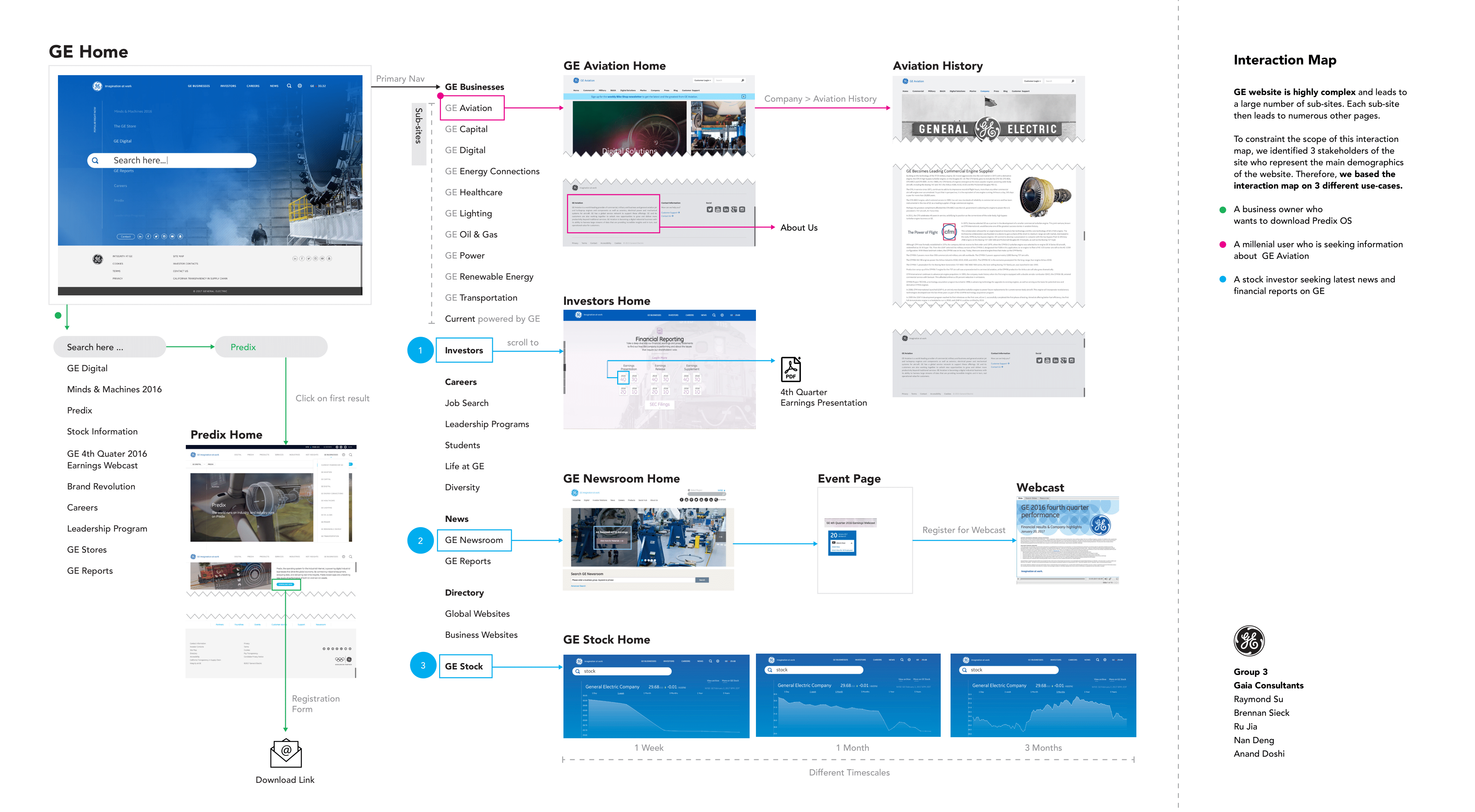
GE's web presence is quite expansive due to the volume of markets they are involved in. Our goal with mapping out the possible interations starting on the home page was to highlight more common routes that would likely be taken by a few of our key stakeholders (applicants, stock holders, business owners). Although the map is not completely exhaustive, it offfers a representation of the complexity within GE's web platforms.
INTERVIEWS & PERSONAS
Our team conducted an interview-based study for GE with analytical tools and methods such as affinity diagraming, as well as personas and scenarios. A formal stakeholder interview and pre-screen survey was conducted before five target users' interviews to get a better scope of the project and select the best interviewees. Read full report
COMPARATIVE ANALYSIS
In order to understand potential reasons why companies like Google and Amazon are able to attract top talent amongst millennials, we conducted comparative research on GE Digital’s competitors, keeping in mind their goal to be among the top 10 software companies in the world by 2020. Read full report
SURVEYS
Our team conducted online surveys with responses from 86 millennials, whose age ranges from 18 to 34. The survey was distributed via various Facebook groups, Reddit, UMSI open listservs, students from various universities, and personal acquaintances. Our goals were to find how respondents perceive tech companies, find intrinsic and extrinsic motivations that attract young talent, and ways in which GE can improve the user experience its website to address the findings of the surveys. Read full report
HEURISTIC EVALUATION
This report describes the methods, findings and recommendations of our team’s heuristic evaluation for GE’s websites. A heuristic evaluation is an examination performed by a designer on a user interface to judge its usability based on recognized principles. Read full report
USABILITY TESTING
The goal of the usability tests was to better understand how users interact with GE’s website and get relevant information. In addition to general usability, our test incorporated 4 main tasks with various subtasks nested within them. The tasks pertained to job searching, finding out about company culture at GE, exploring products offered by GE Digital, and exploring GE’s social initiatives. Read full report
REFLECTION
After our team had concluded our user research initiatives for the GE Digital team we sent our video summary, which included our key findings and recommendations, to our client contact representative. I was delighted and proud to hear that all of the hard work we put into that project was very well received by the leadership team at GE Digital. This experience helped instill in me the business value of the research we had conducted and left me with a clear and simple strategy for applying the same methodology to future projects.

