MOCKSTARKET
- Team Size: 3
- Role: Cofounder
- Timeline: 8 Months
A simulated multiplayer stock market where all the companies and money are made up. What began as a summer programming project, quickly grew into a feature rich web application that offered myself and two others a great opportunity to design and build a product from scratch.
AT A GLANCE
There is not an online environment where people can have fun competing with each other in a gamified stock market.
Mockstarket is real-time gamified stock market where players can create an account for free, buy and sell stocks, level up, acquire items to boost their outcomes, and chat with other players along the way. All of the thrill of trading stocks without any of the risk.
- Usability Testing,
- User Flows,
- Wireframing,
- Personas,
- Interactive Prototyping
- Vue.js,
- Docker,
- Golang,
- Sketch,
- Illustrator,
- HTML,
- CSS,
- Javascript
BACKGROUND
Mockstarket began as a summer side project that I started with my cousin in order to teach him the basics of web app development using Flask. Together we set out to create a web application that serves as a model stock market for people who like the challenge of trying to beat the market. For me, mockstarket served as a great opportunity take on the role of lead designer and create something from the ground up that people would enjoy using.
The main goal for the project was to create a gamified version of a stock market that allowed users to buy and sell shares of fictional companies and compete with each other to see who can become the best investor.
After creating the initial prototype, we were eager to start gathering feedback on the interface, game design, and user experience. I worked with the team and we decided that the most feasible option would be to conduct multiple small-scale usability tests that would identify pain points and help us to collect actionable feedback that would help drive the project forward. The next step was to synthesize our results into key takeaways:
- Users want features that increase the amount of interactions between players
- Users want to be able to track their performance and compare it to other players
- Majority of users agreed that a real-time game system would be more interesting than a round-based system
Having these key takeaways identified, I began to redesign the interface to maximize this new vision of what the user experience could be. In addition to the redesign, we chose to partner with another friend of ours who was interested in rebuilding the backend of Mockstarket using websockets and Go. With real-time trading as one of our larger goals for the next version, a websocket based backend seemed like the best choice.
DESIGN
Why is wireframing important?
At first glance, wireframes may seem like an unnecessary step in the design process. Why take the time to design something that doesn't necessarily resemble the end deliverable? To me, the answer is simple. Wireframing enables designers to create the blueprint for product they are working on without getting bogged down in details like color, font size, and animation.
An analogy I like to use when explaining the value of wireframes is to have someone imagine an architect trying to design a house for a client without first coming to an agreement on the structural blueprint, and instead trying to come to an agreement on what color the walls should be and what brand of windows should be installed before anything else. Wireframing enables designers to quickly iterate on important structural and UX decisions with clients, which saves everyone a lot of time throughout the lifecycle of a project.
WIREFRAMES
After we had a somewhat stable backend up and running that was able to send and receive all of the different updates we needed for the front end, I began to construct the front end based on the new wireframes I created. These wireframes incorporated a handful of newly added features:

Low fidelity wireframe of the Dashboard and tabbed panel layout of the interface

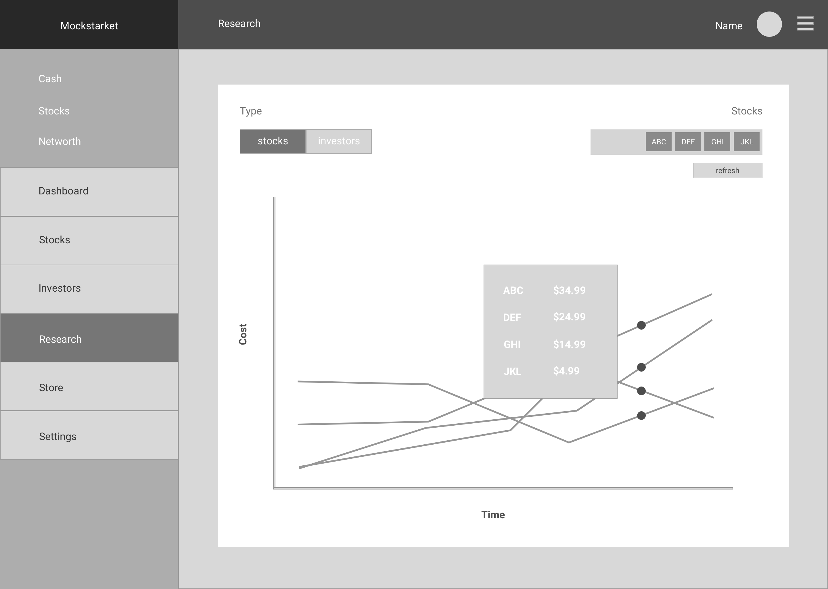

Low fidelity wireframes of the Buy/Sell modal, Research, and Chat interfaces
VISUAL DESIGN

Research Sandbox for visualizing stock and player performance over time
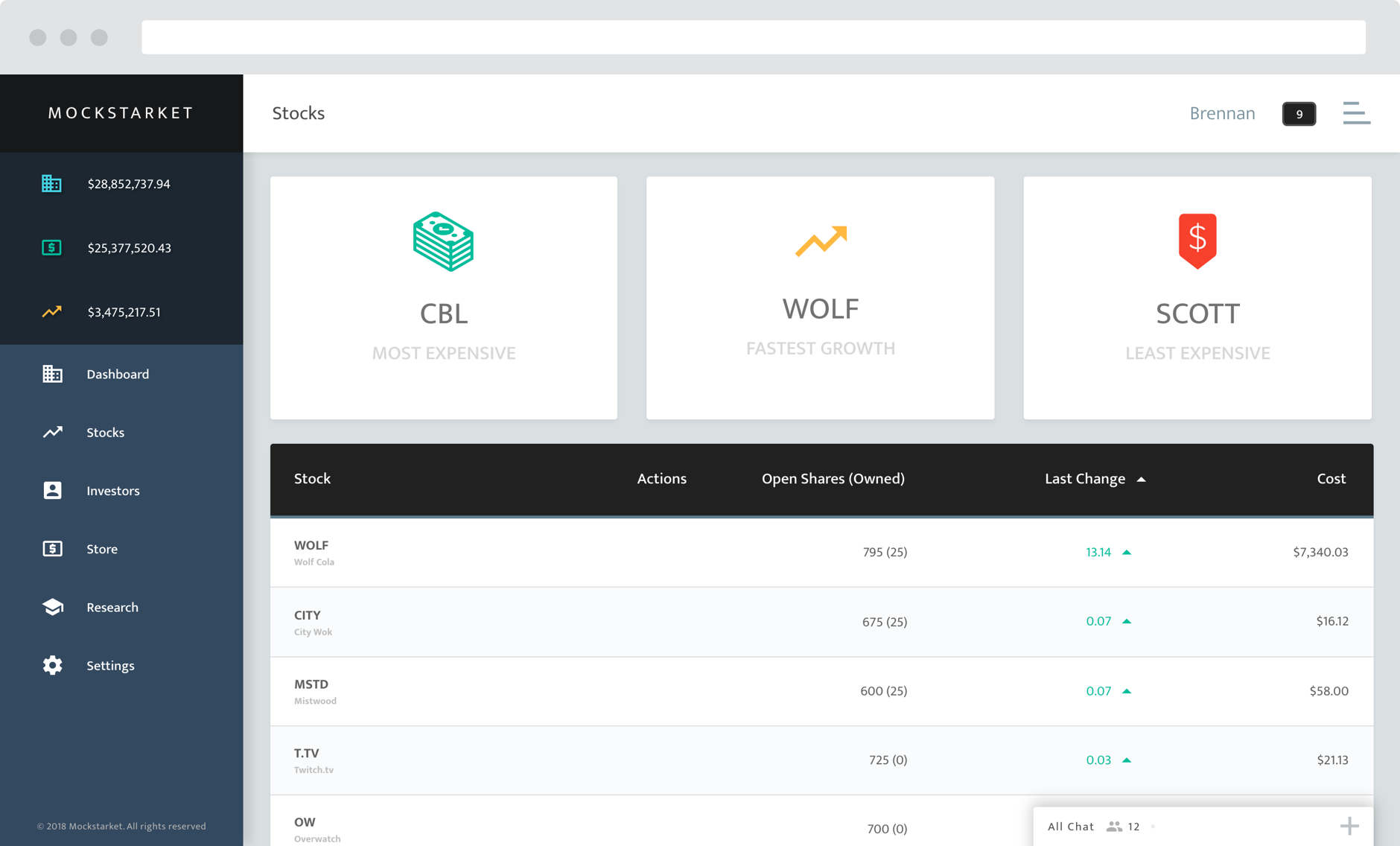
Stocks view for showing players a list of all available stocks on the market


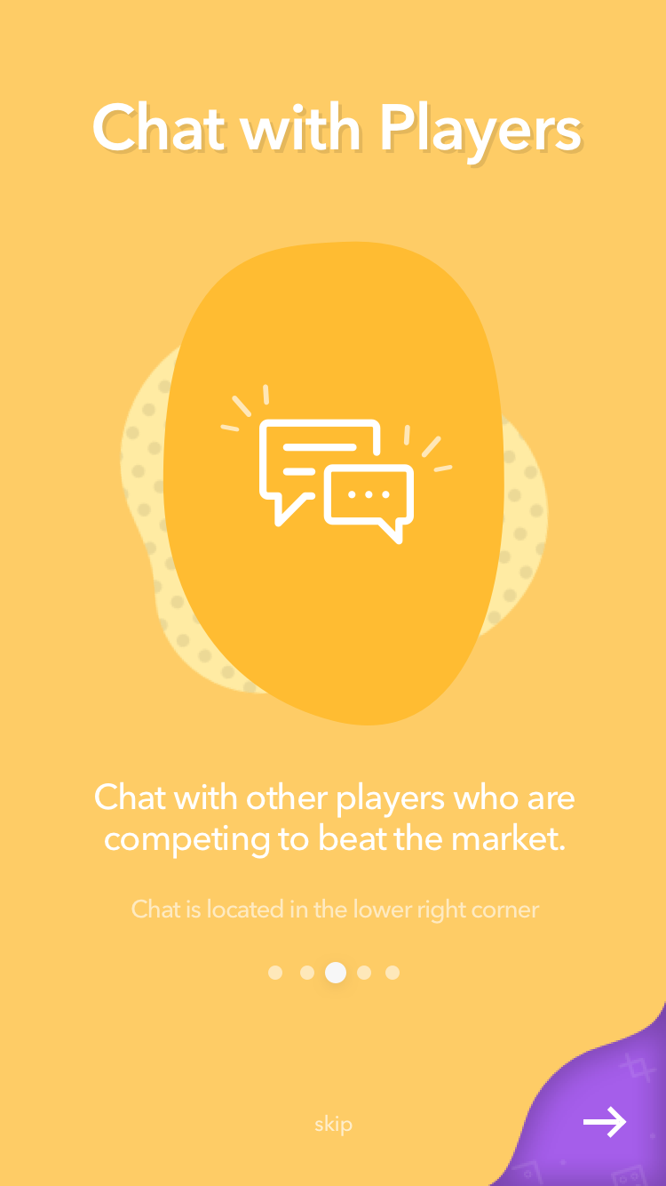

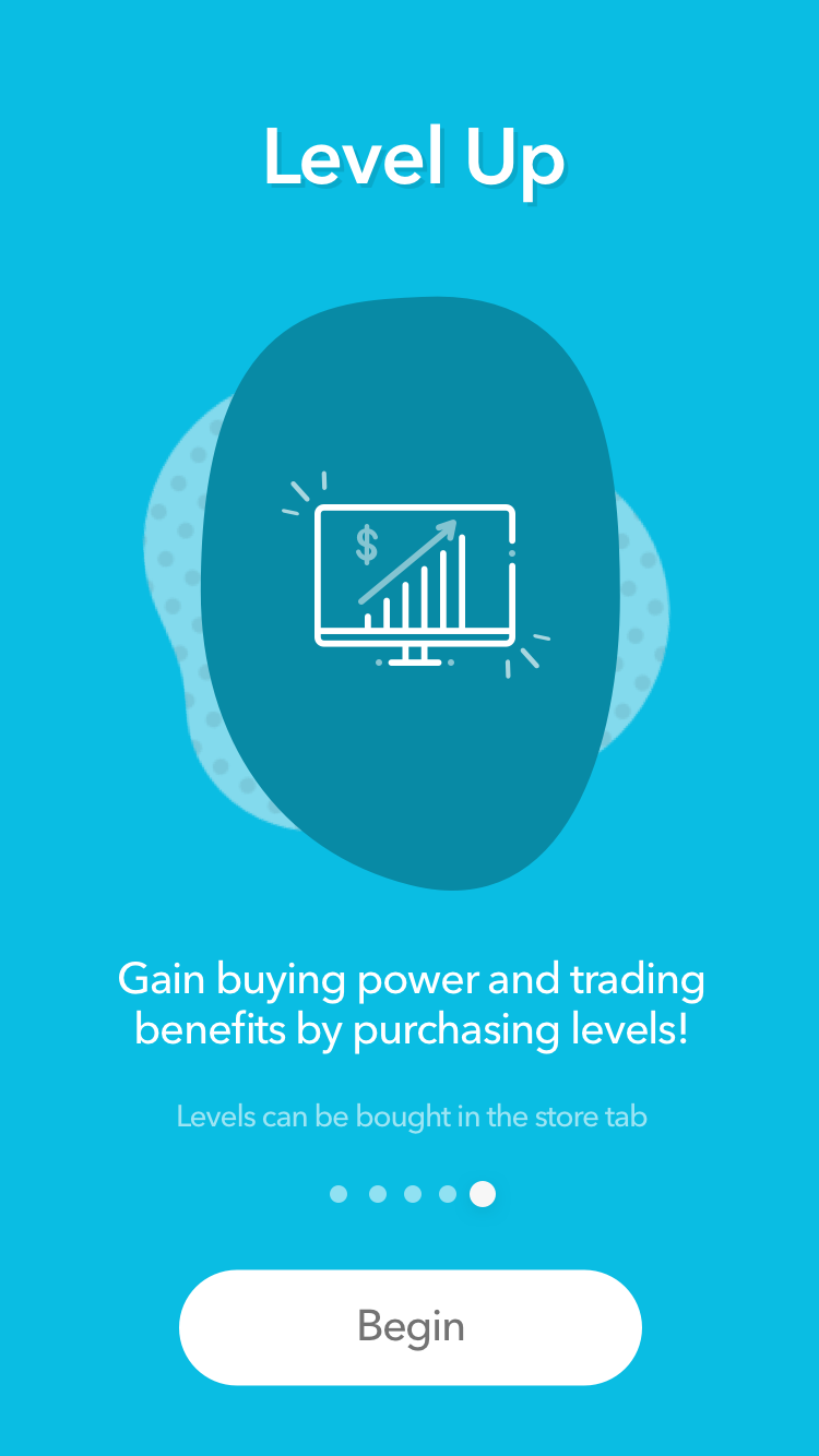
Mobile UI mockups for Login, Buy/Sell, Portfolio, and Menu screens
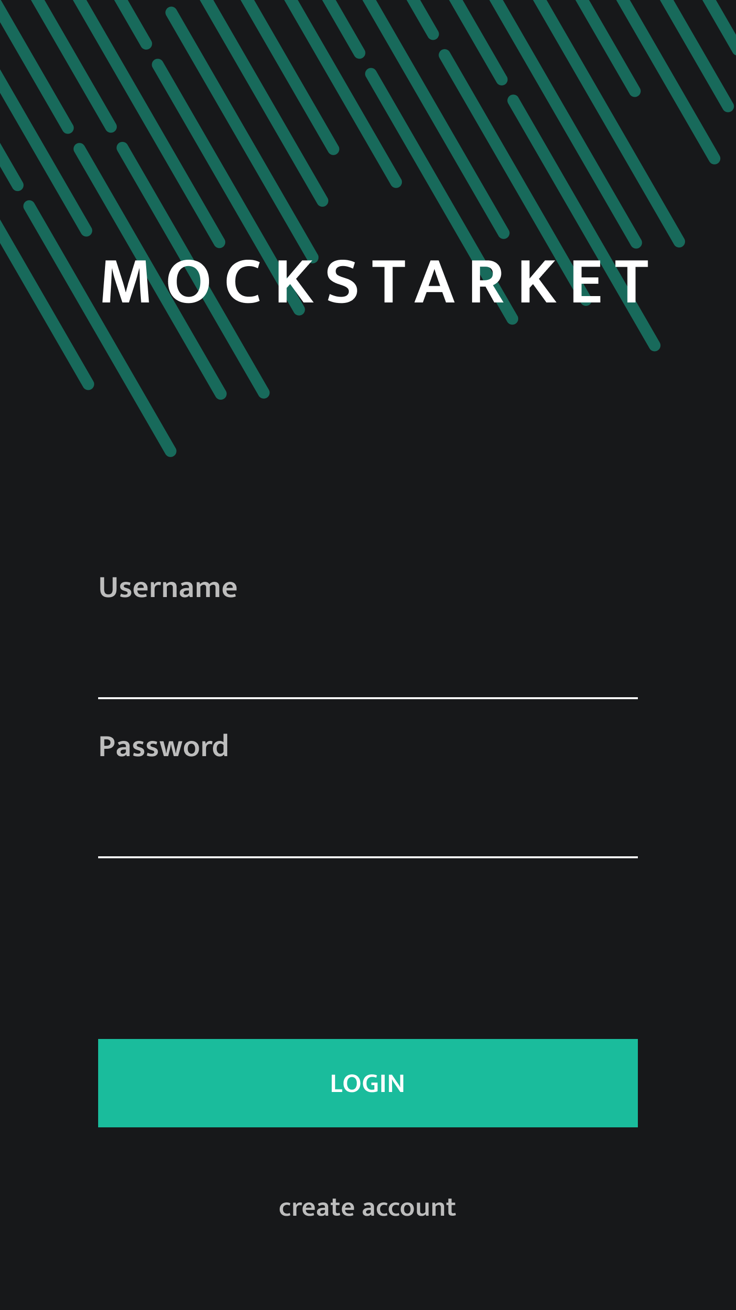

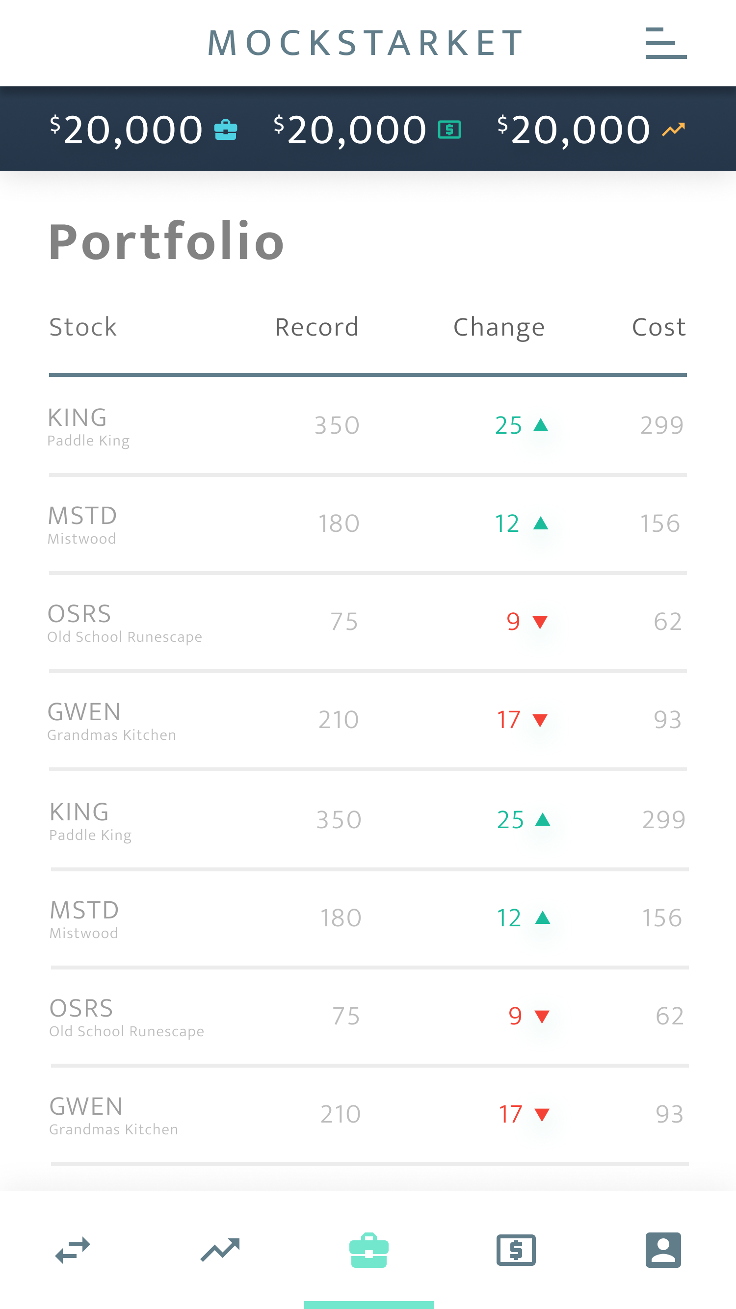


Mobile UI mockups for Login, Buy/Sell, Portfolio, and Menu screens
NOTIFICATIONS
The realtime nature of Mockstarket made me want to incorporate reactivity into as many aspects of the design as possible. It was a great opportunity to design and implement an "unread message" notification that indicated the state of the system at the favicon level along with an audio alert and a animated dot within the chat window.
Favicons: Not logged in, logged in, unread chat message
LOGO SKETCHES
Preliminary sketches showing the assortment of concepts I shot down in order to get to the final design.


FINAL LOGO
I chose to have the logo incorporate iconic buildings from the cities that each of the team members lived in during the time we worked on the project. My goal was to illustrate the idea that Mockstarket was always meant to be an imitation stock market instead of an offical "stock market". In an attempt to accomplish that, I chose to have the Mockstarket "M" projected onto the central building instead of have giving Mockstarket a buiding of its' own. This was one of my first ventures in logo design so I just tried to have fun with it. I'm happy with what I was able to create and I think it gives mockstarket a little bit of extra character.
INTERACTIONS
BUYING & SELLING
Buying stocks using the modal component
Quickly buying and selling stocks is the bread and butter of Mockstarket. I wanted to design an intuitive modal interface that allowed users to buy and sell stocks quickly as well as get prospective information prior to completing the purchase or sale. In addition to the standard numberic input field, I added a set of calculator-esque buttons that allow the user to add to their order, as well as automically buy or sell the maximum allowable amount.
RESEARCH
Charting stock performance using the research tool
Buying and selling stocks at the right moment is essential to beating other players in Mockstarket. Experienced players will frequently chart the performance of a stock or another investor in order to inform their decision making. The research tool enables users to create a data visualization of up to 5 stocks or 5 players at a time.
RESEARCH
USABILITY TESTING
A well planned usability test, regardless of the scale, can offer immediately valuable insights into the effectiveness of your design. Over the course of the design and development process, I started to conduct more frequent small-scale usability tests in order to quickly vet the designs I was working on. This feedback pattern helped me to quickly scrap ineffective approaches and focus on fully implementing the designs that actually worked with our users.

USER TASKS
My main goal when designing the tasks for the usability tests was to create a scenario that would clearly highlight as many pain points as possible. After analyzing the results of the usability tests, I was able to identify specific aspects of the interface that lead users to a point of misunderstanding or confusion. With those primary pain points in mind, I was able to more efficiently make alterations to the existing interface design in order to yield a better overall user experience. Read testing protocol
EXAMPLE TASK
Task 9
Context: Researching a stock’s performance
Statement: You are interested in seeing how your stock has been performing lately. Using the Research tab, attempt to chart the performance of the stock you just bought. If possible, tell me what the highest price of the stock was in the last couple of hours.
Success Criteria: User successfully enters the name of the stock they own and then reports the highest price.
BACKEND
OVERVIEW
The current version of the backend is built upon a real-time websocket connection model. Simply put, whenever anyone does anything within Mockstarket, everyone gets notified at the same time. When a stock price changes, everyone sees the change happen at the exact same time. When a user sends a chat message, everyone sees the message appear in the chat window at the same time.
Functional diagram of the websocket datapath model
TECHNO BABBLE
In order to make this type of experience possible, we chose to implement the backend using technologies such as Docker, Golang, and PostgreSQL. The frontend was built using Vue.js and good old fashion HTML, CSS, and Javascript.
We chose to use Go mainly because the lead backend developer was interested in learning how to use it. Additionally, Go is a modern and very efficient language that happens works well in a websocket environment and is simple to write as well as simple to read.
PostgreSQL was a pretty simple choice due to our interest in using document-based databases that could primarily store data using JSON objects.
Vue was the last peace of the puzzle and was used in order to gather, organize, and render all of the updates streaming through the websocket connections. As the lead frontend developer, I chose to use Vue because I wanted to work with something that offered the bare necessities for reactive component rendering, without having to include the large overhead included in other monolithic frameworks.
If the nuts and bolts are of interest to you, feel free to take a gander at the GitHub page.
REFLECTION
DESIGN
There is still a lot of work to be done on the UI design of Mockstarket and the finish line is very far off in the distance. My initial goal was to design the overall look and feel of the interface, and then expand on it as needed. I believe that what I have designed thus far has worked well for what Mockstarket currently offers to users. In time, I would like to take another pass at the design at a few of the current features, as well as design more features that can be added into the existing interface.
First, I think the notifications should be revisited so that they can deliver a more useful package of information to the user, as well as embed simple bits of functionality within the notification itself so that users can quickly act on events that occur within the Mockstarket ecosystem.
Another aspect that I would like to expand on is the item store. Right now, it is fairly barren and only really gives users a large list of items they can spend their in-game money on. Ideally, I would like for the store to have much more explanatory information regarding the progression system.
One of the largest design hurdles to tackle is the inevitable need to have users be able to play the game on mobile devices. Mockstarket is by no means mobile-friendly at the moment, which constantly bugs me. Given the initial push to get a proof of concept up and running, we chose to focus all of our development and design efforts on the desktop version of Mockstarket. Now that the desktop version is up and running, my efforts can be focused more on the mobile interface design challenges that arise when trying to clearly display an information dense system in an approachable and user friendly manner.
FUTURE
The future of Mockstarket holds many exciting additions and improvements that I am excited to make a reality. The main priority is to make the game 100% accessible on all mobile devices. A lot of the design work relating to making the interface components fit naturally into a responsive environment has already been done, so all that is left to do is finish is the front end development work, as well as usability testing for the mobile interface.
In addition to being mobile-friendly, I would like to flesh out a more in-depth progression system that takes more into consideration that just the user’s cash availability. I am uncertain how this new system will look in the end, but I am excited to start brainstorming with the team about how we can make our game even more engaging.
