CASE STUDY: HOTPADS
- Team Size: 1
- Role: UX Auditer
- Timeline: 3 Hours
I chose to conduct a UX audit on a SERP (Search Engine Results Page) that had a information-dense search result page in order to understand the strategies used to effectively return a helpful set of relevant results to a user.
BACKGROUND
In order to further examine the SERP design practices of popular online services, I chose to explore Hotpads, a relatively new player in the online rental search market. HotPads describes themselves as an online search engine that shows homes for sale, apartments for rent, and gives the inside scoop on neighborhoods you'll dig. They claim to be home to the largest amount of verified homes and the most accurate and up-to-date rentals. In addition to traditional listings, Hotpads offers simplified search for rentals by room for rent, income restricted, student housing, senior housing, and more.
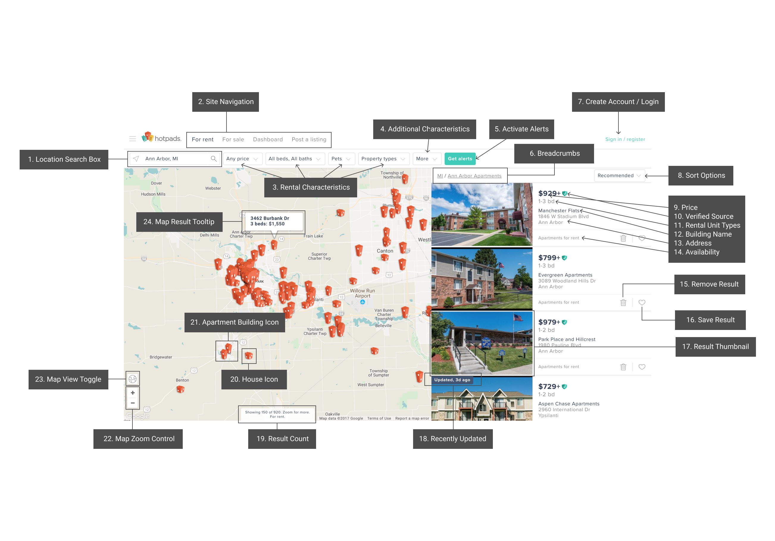
Annotated screen shot of Hotpad's search result UI
EXPERIENCE
SEARCH
Overall, I found the Hotpads search experience to be intuitive and enjoyable. I liked how I didn’t have to know much about a city in order to browse listings that are relevant to me. This lead me to explore far more options that I may have otherwise in a case where I was limited by searching via particular locations within a city. Additionally, I liked how Hotpads presented the results for my query, although I felt that they could have handled densely populated cities in a more effective manner. It was sometimes frustrating to have to zoom in and out, over and over, in order to use the map as a tool for my search.
Furthermore, I really liked how Hotpads gives you a sense of the varieties of rental properties in any given city. I felt like I would not have been able to find as many unexpected relevant results in a different search engine. In conclusion, I think Hotpads is an excellent service for anyone who is trying to explore new and exciting rental opportunities either in the place they currently live, or in a completely foreign location.
DESIGN CRITIQUE
THE GOOD
- Extensive filters. Hotpads SERP page offers users the ability to filter their results by a variety of very specific filter options. This type of advanced filtering can be very helpful for users who are looking to find a specific type of rental unit in a given city. I think that this is a killer feature that sets Hotpads apart from other rental property search engines.
- City map paired with simple and clean listings. The way in which Hotpads displays the listing results right beside the map of the city the user searched for, gives users the ability to visually identify regions of the city they are most interested in. Furthermore, users can search via the map to find out where specific listings are located within the city. For example, if someone was looking for a rental by the ocean, they could simple click on the building icons near the water in the city to view those specific results.
- Extended visibility and detailed property information. Hotpads does a great job of getting the parties who list rental properties to include as many photos of the building/unit as possible. In addition, when a user decides to further research a specific result from their query, they can view the floorplan, unit varieties, reviews, and a variety of other helpful information for their search.
THE BAD
- Overly crowded map results. If a user is searching for listings in a large city, the default zoom of the map usually is packed with building icons, which can make it difficult, and sometimes impossible, to use the map as an extension of the information retrieval process.
- Misleading cost information. On occasion, the cost listed for a particular unit may not be entirely reliable. For instance, nearly every listing shows the cheapest rental type, instead of giving users information such as a price range for available listings. A user can only determine the actual cost of their desired unit by further exploring a specific result. This in turn can make the IR process take longer than necessary and possibly lead to user dissatisfaction after multiple disappointments when looking for listings that are within their price range.

