SIFT
- Team Size: 1
- Role: Designer
- Timeline: 4 Months
A service that I designed with the goal of making it easier for people to browse and find the right urban farming facilities near them. Sift was my solution to the problem of finding an urban farm that suited your needs as an urban farmer.
AT A GLANCE
As it stands, available resources intended to help people get involved with urban farming are very dispersed and lack a sense of modern and intuitive design. This results in a high barrier of entry for anyone who is trying to get started with urban farming.
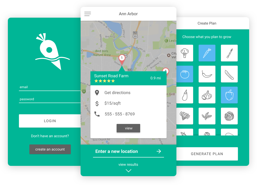
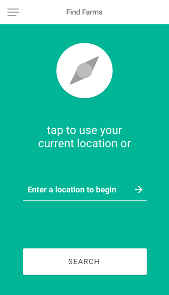
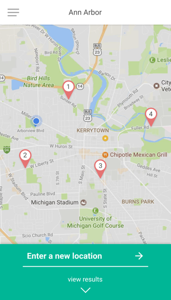
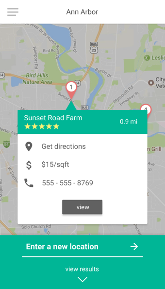
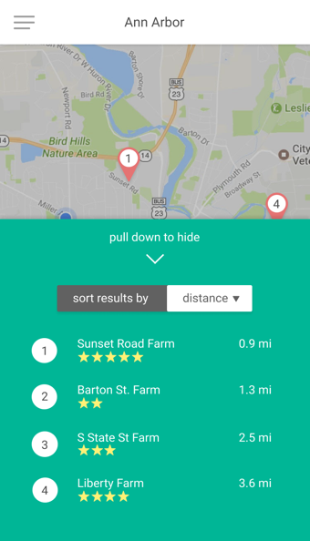
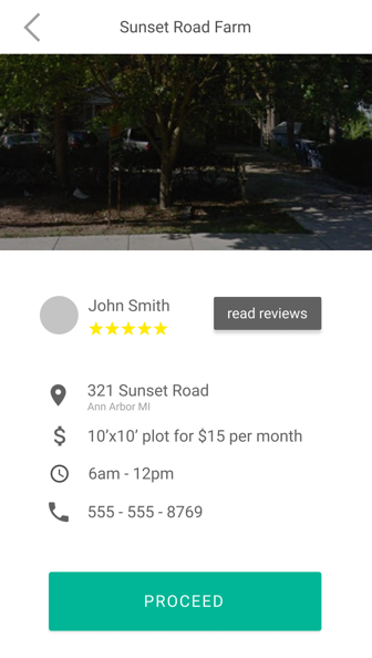
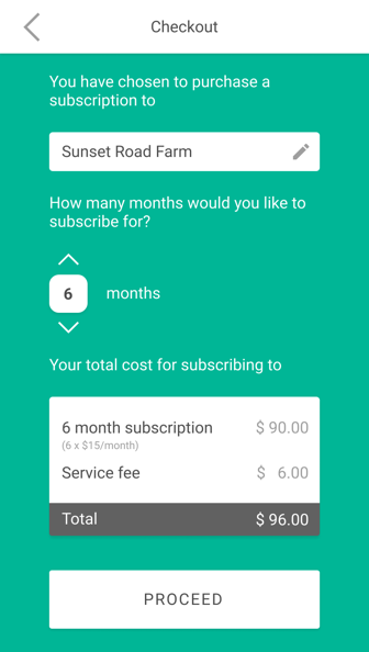
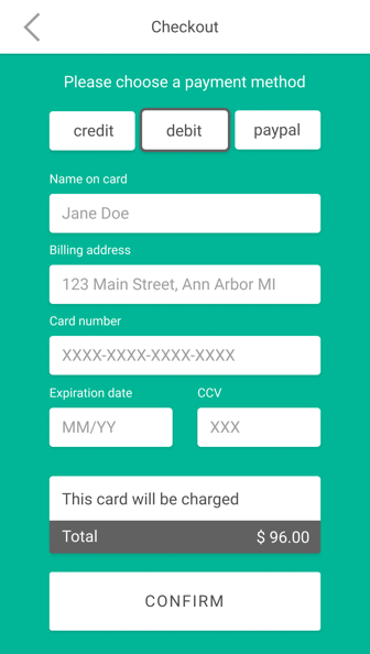
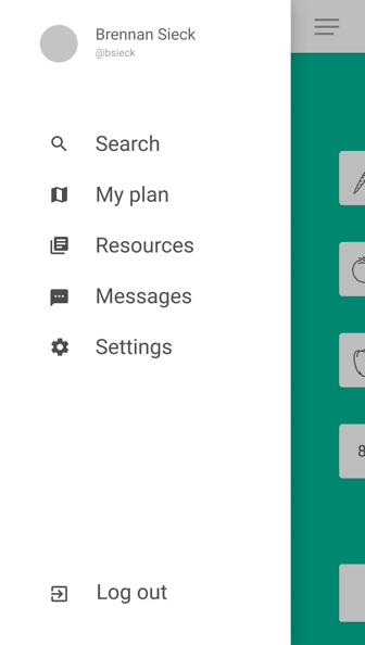
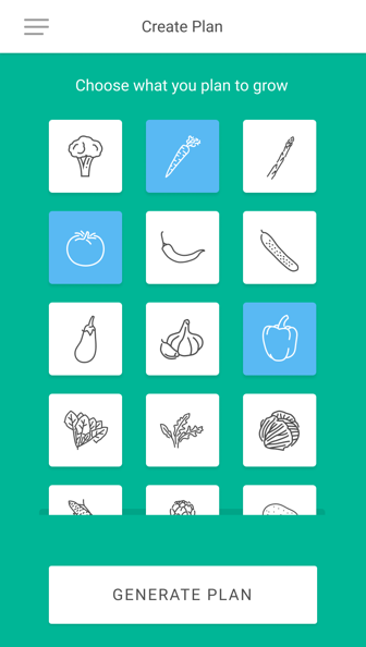
Sift is a mobile application that serves to assist people who are interested in exploring urban farming from a variety of different perspectives. Sift assists users with browsing and finding the right urban farm, helping users create their own customized farming plan, and connecting users with high-quality information about urban farming.
- Usability Testing,
- User Flows,
- Affinity Diagramming,
- Wireframing,
- Surveys,
- Personas,
- Group Design Review,
- Interactive Prototyping
- Sketch,
- InVision,
- Figma
BACKGROUND
For my individual project I have chosen to examine the system surrounding accessible urban farming. Urban farming is starting to catch on in dense urban environments such as New York City due to the demand for fresh and locally sourced produce. Normally, someone looking for fresh produce would go to a market or a grocery store and buy whatever they have in stock. This option is not enough for some residents, who are looking to grow their own produce themselves. Additionally, urban farming provides a way for low socioeconomic families or individuals to cheaply generate their own produce.
PROBLEM STATEMENT
As it stands, available resources intended to help people get involved with urban farming are very dispersed and lack a sense of modern and intuitive design. This results in a high barrier of entry for anyone who is trying to get started with urban farming.
PROCESS
DESIGN METHODS
My solution began as a broad collection of mostly non-technical avenues of solving the urban farming accessibility problem. Throughout the course of the project, I reevaluated my solution by working through design exercises such as sketching, competitive analysis, storyboarding, creating personas, QOC, paper prototyping, and digital prototyping. Each exercise and feedback round helped me solidify what I wanted to create and how I could most effectively address the problem at hand.
One major design decision was deciding to go with a mobile app as the solution. This decision came after realizing that I could incorporate many non-technical solutions into one streamlined experience via the use of an app. One major change to the solution occurred after conducting my user testing on the paper prototype. I received feedback that the order of interaction within my app seemed to be backwards to the users. I was told that it would be more natural and intuitive for the users to create a plan before they went off on their search for farms. I took this as the users looking to create a sense of confidence regarding what they were looking to take on before they started reviewing farms. This was a great insight that I had not imagined during the previous design phases of the project. It completely changed the way a user would experience my solution. In the reading by Dow et al. from the Stanford HCI Group, they mention the benefit and process to prototyping:

After reading that paper, I immediately saw the value in creating low fidelity prototypes and testing them on potential users in order to gain valuable feedback from a low time investment. In the paper, they mention that the cost of prototyping can be compared to the cost of making changes later on in the course of a project, especially after many hours have been spent developing a solution that needs to be changed. These costs can be avoided by prototyping and I saw the benefit of that practice first hand when my user feedback group told me that the order of processes in my solution should be reversed.
PROTOTYPING
DELIVERABLES
VISUAL DESIGN
LOGO
REFLECTION
As the sole designer on this project, I learned quite a bit about the assumptions I bring into problem solving and brainstorming. I’ve learned that it is incredibly beneficial to consider alternative user perspectives and motives that are not similar to your own. In the past, I have been blinded by the subconscious urge to design a solution that would be perfect for me, but now I have experienced the advantages of blocking out those urges and instead design for the end users.
I wanted to create a system that emphasized trust between the user, the system, and the problem at hand. It was essential that I designed a solution that served to build confidence through simplicity and intuitiveness. I wanted users to feel comfortable searching the area around them for places that suited their needs, which in this case would be access to urban farming facilities.
DESIGN
The time I spent creating Sift from the ground up has taught me a great deal about the value of prototyping, applying personas, creating user story maps, and synthesizing all of the aspects of my design process into a final product. One thing that stood out to me was how much I benefited from roundtable design reviews. I was exposed to a variety of different viewpoints from my fellow classmates that helped me develop new perspectives to use when making design decisions about which direction to take my vision for Sift. I believe that Sift would have been very different if I didn’t have the support and advice from those around me during the design process.
REFERENCES
The Efficacy of Prototyping Under Time Constraints, Steven P. Dow, Kate Heddleston, Scott R. Klemmer. Creativity & Cognition, 2009
